

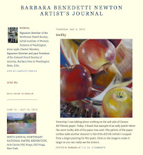
On another subject, blog subscriber Karen asked if I could explain the Kodak Color Separation Guide and Gray Scale sometimes included in my work-in-progress shots. When I photograph my work, I always include this for color reference. If the color bar doesn't look right, I know the color of the art is off. Here's the blurb from Kodak: "... Separation Guides are used as the set up guide to calibrate several digital color print systems. In addition, helps photographers compare the color of the subject with known printing colors. Also helps Graphic Arts camera operators identify separation negatives and positives for color reproduction processes. "


No comments:
Post a Comment